Analysing the bold new RSL Care + RDNS branding
Imagine the marketing challenge. Two really big Not For Profit care providers merge (in 2015), one in Victoria and one in QLD, each with iconic reputations and visual brands in their local markets. Now the Board wants to bring the combined 6,500...


Imagine the marketing challenge. Two really big Not For Profit care providers merge (in 2015), one in Victoria and one in QLD, each with iconic reputations and visual brands in their local markets.
Now the Board wants to bring the combined 6,500 staff together under one brand, and reposition the business for 100% growth in five years in a totally new competitive environment called Consumer Directed Care (CDC).
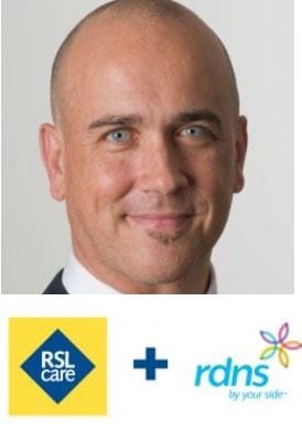
That was the brief given to the internal RSL Care + RDNS marketing team led by Dan Woods (pictured), Exec. GM – Brand and Business Development.
Twelve months later they unveiled ‘Bolton Clarke: Be true to you’.
RSL (founded in 1916) gone. Royal District Nursing Service (founded in 1885) gone. The word ‘care’ gone. Any reference to a Not For Profit mission or status – gone.
Why, what’s the strategy and how did they get here?
The Board and the CEO, Steve Muggleton, want to lead change, not react to it. And Steve tells us that staff are central to this in a new marketplace where consumers have choice.
Staff delivering services need a clear understanding of intentions.
Not opting for a ‘trite or constructed’ name was strong signal of intent.
Dan Woods tells us they had a couple of consultants that they used at times – they did not engage a major external agency. The rest was done internally. They invested significant time in market research – again using internal resources - testing every component of the positioning before he and his team settled on the new name and strapline.
Paying homage to two significant figures in the history of the combined organisation delivered the name Bolton Clarke, which delivered the strength, purpose and historic perspective.
William Bolton led soldiers on the first day of Gallipoli and was the first President of the Returned Sailors’ and Soldiers’ League (now the RSL).
Lady Janet Clarke was President of the Melbourne District Nursing Society (later RDNS) for most of 20 years from 1889.
Woods says of ‘Be true to you’: irrespective of age the central self is always there and should be able to express itself. This is relevant for clients and for staff in a values-based organisation.
The graphic in the logo with its gradient of colour is designed to put the recipient in the middle. It represents a congruence of values.
“The individual continues to change and evolve – customer centricity – we have to change constantly”.
Our view at THE SHIFT? When we first heard the name, we thought it sounded like a firm of solicitors.
However when we understood the brief we came around to thinking it was bold and it will serve the business very well, because it gives a template to explain why ‘Bolton Clarke’ and it communicates we are here to do a competitive job and do it very well, without any baggage of charitable perceptions.
It strikes us that it is all about ‘intent’. And that is very strong – with the target audiences being staff and customers in a consumer directed world.
Good job!


