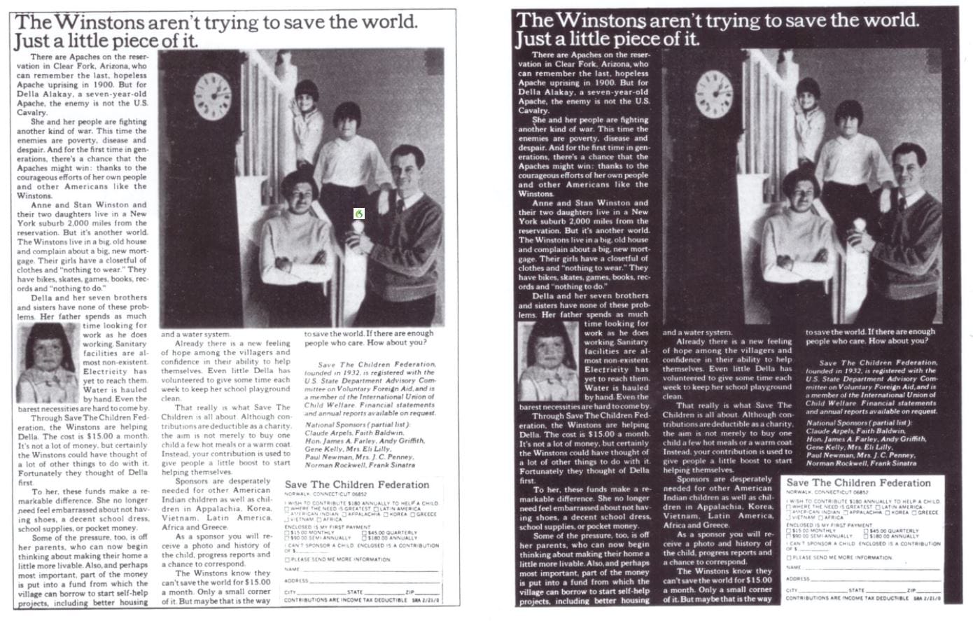
Reverse type may look good and clever but it is lazy design
We stumbled across a website this week for a service provider where all the type was white on a black background. They were attempting to position themselves as a ‘design’ oriented company. Instead they presented a mass of unreadable words. In...

We stumbled across a website this week for a service provider where all the type was white on a black background. They were attempting to position themselves as a ‘design’ oriented company.
Instead they presented a mass of unreadable words.
In the old world of print and design a golden rule if you want to be read is don’t use ‘reverse type’.
Given up to 50% of people open websites on the phone this rule doubly applies.
The answer: work harder for quality thinking based design.


